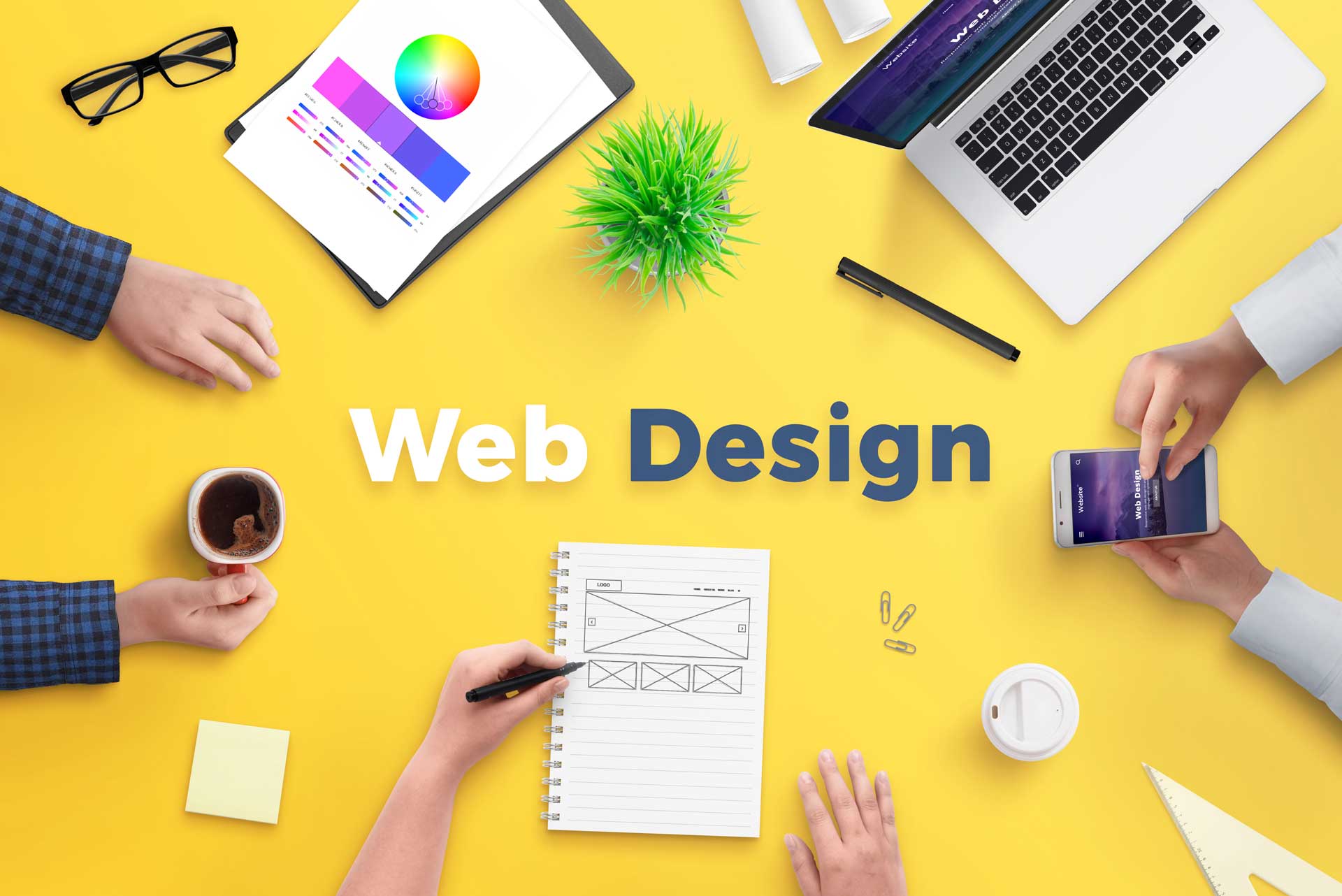
Undoubtedly, a great website layout could make a difference in your brand. You’ll surely make your visitors want to know more about what you can offer. Having said so, there are web design trends that you must put in mind if you are trying to put up a website. Web design trends are indeed game changers and every web designer should be able to implement them in their next project.
This will give your website an edge over your competitors and traffic should increase as visitors are having a good time browsing your site.
The Best Practices
There are good old methods where you can make your website stand out. Forget about the over-complicated CSS and HTML codes. Yes, they are also elements of web design but it is proven that success is not reliant on how fancy your website is.
Let us try to enumerate the best practices that you can integrate immediately into your next project.
- Simple Layout: Nothing beats simplicity when it comes to websites. People do not want to browse over-designed websites due to the fact that they are complicated to use. Still, people will choose a clean layout as they can find what they are looking for easily and faster. Nothing beats the classic clean layout when it comes to SEO optimization as search engines could find and rank them easily.
- Branded visuals: You must ensure that the graphics you are placing on your website are all related to your brand.
- Topnotch content: Make sure that the content you are putting on your website meets the norm of quality standards. This includes content that is free from plagiarism, engaging, and optimized for SEO.
What are the trends?
Now you already know the best practices that will continue to be usable with your web design projects, it is now time to know the latest trends in the web design industry.
Claymorphism
By making the illustrations and other 3D elements interactive, you can surely make the most out of your minimalist design. You just need to mix 4 styles such as big rounded corners, light, pastel, and vivid colors, double inner shadow, and outer shadow.
Artificial Intelligence
There are lots of features that artificial intelligence can offer. One of the most popular trends that continues to become a crowd favorite this year is the use of AIs and chatbots are AIs that you should not miss.
Your primary goal for creating a website is to have great user engagement. So chatbots were created to ensure that someone will answer the inquiries of the visitor in real-time without any human intervention thus helping the site owner to save time and effort in answering the queries of their website visitors.
Complex Gradients
Although you are fully aware that gradients are already existing even before 2023, complex gradient transforms it into a whole new level. It makes web designers more creative by forming an illusion of movement without compromising the minimalistic look of your site. If you are not into mixing colors, there are gradient generators all over the internet that can help you speed up the task.
Augmented Reality
The introduction of A/Rs in the world of web design is truly a big hit. This trend will continue to exist this year as a significant number of users are using smartphones and getting fascinated with online shopping, A/R is the answer. Amazon has great A/R technology that allows the user to try the shoes that they like to try without the need to be physically present in the shop.
Nostalgia
Nothing is better than reminiscing the great memories that you’ve had in the past. Integrating nostalgic moments in a site is one of the growing trends in the industry. The main reason for its existence is that we have been bombarded with lockdowns during the pandemic and what’s left for us is to reminisce the great memories with our family and friends when we are all still free to go out of our homes and have fun.
Dark Mode
Since we are in a post-pandemic era, it is significantly important for people to save the battery life of their devices. The dark mode is proven to prolong the battery life extensively which is very useful if you are outdoors. Also, it avoids the chances of getting your eyes strained from continuous exposure to a bright screen. Having said so, this trend will continue to exist not only this 2023 but for more years to come.
Progress Indicators
By knowing that the webpage is responsive, the user will not have any worries that his or her effort will go to waste. You can usually find these progress indicators on forms that contain multiple processes and download pop-up boxes.
Hand-Drawn Art
The use of manually hand-drawn graphics is getting popular these days. Once you put these elements, it adds value and originality to your website.
Hoverable Iconography
Simplicity must be the main goal of every web designer. A hover-triggered helper text over icons will be very useful to avoid barriers for some of your website visitors and make your site more accessible for them.
Behavioral Design
Because of the digital age, people became too lazy to do the usual tasks daily. People even skip doing physical activities because the results are not instant. In this manner, behavioral design comes into the picture. By having a reward system, there will be some sort of motivation. The user experience is improve and a particular behavior is triggered.
Interactive Fonts
There is no doubt that the fonts of a website leave a lasting impression. With the use of interactive fonts, your creativity as a web designer will be unleash. You can play around with the different effects such as changing the weight of the font every second or even having a shrinking effect with a black background.
Retro Futurism
There are no signs of slowing down when it comes to having a design that is retro and classic. Considering retro-futurism as one of the elements of your website will give a unique experience to your visitors.
Overlapping Text
As you can notice, even famous websites have overlapping elements on their homepage. It is not an error in design but is intended to catch the attention of the site’s visitors. Experimenting with overlapping text is a great idea and can be apply to the various components of your website such as headlines, sidebars, and menu bars.
Interactive 404 Error Page
Done are the days wherein the 404 error page is just a plain and simple page indicating that your website is down for a reason. However, this page could signal that visitors do not have a reason for them to stay on your website. By making the 404 error page interactive, visitors can stay until you make that website of yours up and running again.
Social Proofing
Being legit in the social media world could bring a difference. By sharing your verified social media pages with the widgets of your site, you are giving visitors the impression that you are a legit brand that they can trust.
Conclusion
Due to the highly-competitive space that cyberspace is offering, your website must have an edge over its competitors. It does not matter what kind of niche you are targeting, it is only essential that you have a site that is update to the latest trends. It makes user experience more interactive which can drive more traffic and eventually sales.[/vc_column_text][/vc_column][/vc_row][vc_row][vc_column][ohio_call_to_action subtitle_type_layout=”bottom_subtitle” icon_use=”1″ icon_position=”right” title_typo=”{“font_size“:““,“line_height“:““,“letter_spacing“:““,“color“:“#ffffff“,“weight“:“inherit“,“style“:“inherit“,“use_custom_font“:false}” subtitle_typo=”{“font_size“:““,“line_height“:““,“letter_spacing“:““,“color“:“#ffffff“,“weight“:“inherit“,“style“:“inherit“,“use_custom_font“:false}” title=”UmVhZHklMjB0byUyMG1ha2UlMjB5b3VyJTIwd2Vic2l0ZSUyMHN0YW5kJTIwb3V0JTNGJTIwV2FudCUyMHRvJTIwY3JlYXRlJTIwYW4lMjB1bmZvcmdldHRhYmxlJTIwb25saW5lJTIwcHJlc2VuY2UlM0Y=” link=”url:https%3A%2F%2Fbiznessprosllc.com%2Fcontact-us%2F|title:Click%20here%20for%20HELP!||” icon_as_icon=”ion ion-ios-arrow-forward” bg_color=”brand” readmore_button=”type=default&size=default&color=#000000&hover-color=#333333&text-color=#ffffff&text-hover-color=#f3f3f3″ subtitle=”R2V0JTIwYSUyMEZSRUUlMjBDT05TVUxUQVRJT04lMjBUb2RheS4=”][/vc_column][/vc_row]


